Heh, Hans Rosling did it again… fascinating stats and explaining world’s population growth (the big fill-up) with some leftover boxes.
http://www.ted.com/talks/hans_rosling_religions_and_babies.html
Tag Archives: visualization
Live mapping of tweets, facebook msgs, emails, sms…
Reading the Wikimedia blog I stumbled over this interesting post. They mention a framework called Ushahidi (Swahili word for “testimony’) with its subproject SwitfRiver which can be used to track and verify the reliability of news concerning current trending topics, possibly helping editors of Wikipedia to enhance the quality.
Digging into I found out the framework is used for live mapping (collection, aggregation and visualization) of disaster and event related messages sent via all different kinds of transports (e.g., twitter, facebook, email, sms…). One example is the 2010 Haiti earthquake. Where it helped to coordinate all the s&r teams.
As I find it quite fascinating how much people who sit at home in their living rooms might be able to help others in a disaster region, I’d like to suggest this talk:
Beautiful data visualizations and why we need open data
Today when I attended a talk at LWA 2010 I remembered a nice talk about beautiful data visualization by Hans Rosling, that I want to share with you (it’s worth the time):
When I searched for this talk I also came across the follwing two, the one above is a must, if you liked it, you might want to invest more time with these:
And last but not least another nice talk in this area, this time by David McCandless:
Precision-Recall diagrams including F-Measure height lines
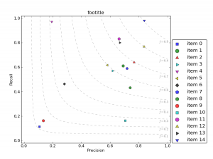
Today I was asked how to generate Recall-Precision diagrams including the f-measure values as height-lines from within python. Actually Gunnar was the one who had this idea quite a while ago, but constantly writing things into files, then loading them with his R code to visualize them, made me create a “pythonified” version. Looks like this (click for large version):

Here’s my python code-snippet for it: recallPrecision.py.
https://gist.github.com/joernhees/c58a4ca92faf3e4c5331
Uses a bunch of pylab internally, but after simply importing this module, you can easily visualize a list of (precision, recall) points like this:
import scipy as sc
import pylab as pl
import recallPrecision as rp
prs = sc.rand(15,2) # precision recall point list
labels = ["item " + str(i) for i in range(15)] # labels for the points
rp.plotPrecisionRecallDiagram("footitle", prs, labels)
pl.show()
(updated on 2014-10-28: link to gist)
