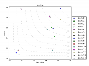
Today I was asked how to generate Recall-Precision diagrams including the f-measure values as height-lines from within python. Actually Gunnar was the one who had this idea quite a while ago, but constantly writing things into files, then loading them with his R code to visualize them, made me create a “pythonified” version. Looks like this (click for large version):

Here’s my python code-snippet for it: recallPrecision.py.
https://gist.github.com/joernhees/c58a4ca92faf3e4c5331
Uses a bunch of pylab internally, but after simply importing this module, you can easily visualize a list of (precision, recall) points like this:
import scipy as sc
import pylab as pl
import recallPrecision as rp
prs = sc.rand(15,2) # precision recall point list
labels = ["item " + str(i) for i in range(15)] # labels for the points
rp.plotPrecisionRecallDiagram("footitle", prs, labels)
pl.show()
(updated on 2014-10-28: link to gist)
